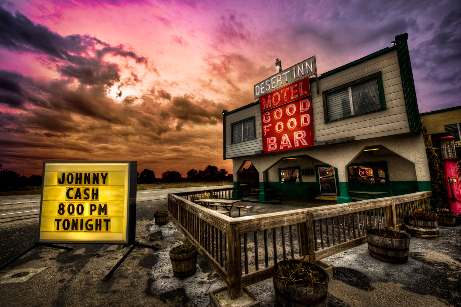
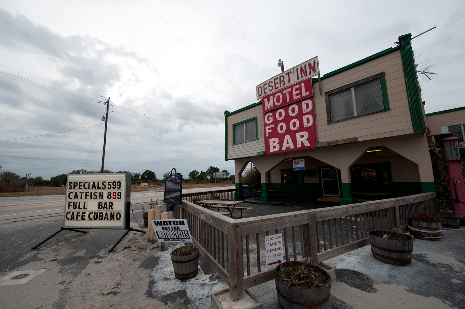
Disclaimer: I did not take this photo. Photo credit goes to Brad Moore, @bmoorevisuals. I edited the photo for a contest at layersmagazine.com by Rafael Concepcion, @aboutRC. The original contest can be viewed here. For the record, I won a print signed by RC & Brad Moore and a signed copy of “A World in HDR” by Trey Ratcliff. The book is fantastic. Go buy it.
I spent many hours editing this picture. I did it for the love of Photoshop not for the prizes. This article is more about editing concepts than a tutorial. I have included some of the general steps and I point to some good online tutorials for more specific direction.
Photoshop Can Be Magical
There are no limits to the editing power of Photoshop… well almost none. I like to consider these four things before I start to edit.
START WITH PLENTY OF QUALITY PIXELS
Don’t waste your time with low res jpegJPEG (pronounced JAY-peg) is a lossy compressed graphic image file. The compression standard was dev... More images. If you’re after a wow image your going to need as many pixels as possible. A camera that shoots 10 megapixels or more is best, and always, always, always shoot in Raw. You can fix almost any exposure problem with a Raw image.
FOCUS
I have lots of photos that aren’t worth editing because I can’t fix the focus or eliminate the camera shake. Start with a good sharp image. When you find a good subject take lots of frames to make sure you capture something worth editing.
SUBJECT MATTER
Photoshop editing can change a picture’s mood, tone, or time and place, but if you don’t like the original content you’re not going to have the passion to spend time editing it. Start with an image you like and make it better.
COMPOSITION
This one is not a deal breaker but it’s still a good idea to start with the best possible composition. Post edit cropping can improve an image. Moving, removing and/or scaling an object can improve a composition too. I enlarged the marqueeRectangular and circular shape selections are made with a Marquee tool. More sign in this image to help balance the overall composition, but that is it. The composition was pretty darn good to start with.
Where to Start
Evaluate the original image. What works? What doesn’t? Why? Think of it as painting. I think of the original photo as my pencil sketch. I love that I have not been to the place where this picture was shot. The building is a historical landmark from a period just before I was born. I wonder what it must have been like in the 1950’s. These thoughts are the genesis for my creativity.
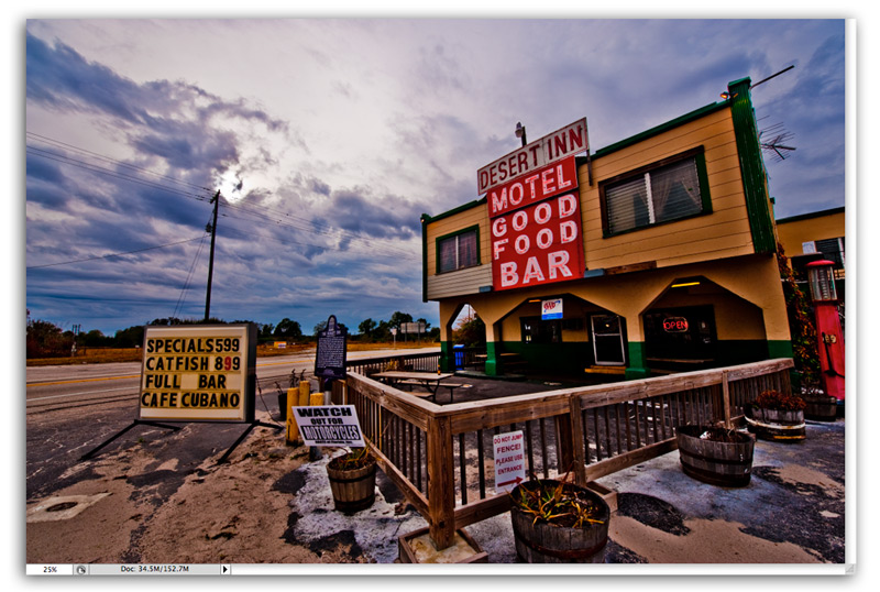
Sunsets are a great way to add color and drama so I start with the sky. Changing the time of day adds a warm mood to the image.
I work with multiple Raw Smart Object Layers to create the color. I first learned this from Ben Wilmore, Photoshop artist and NAPP instructor. Read his article here, specifically the section titled “Multiple Interpretations of the Same Raw File.” I use this technique on virtually every picture I edit.
Make the colors look good by playing with layerAll objects have a stacking order, like a stack of paper. When the layer (paper) is opaque it covers... More blend modes. There are 3 great Blend Modes articles on the NAPP user group website, Demystifying Blend Modes, Demystifying Blend Modes, Pt. 2, Demystifying Blend Modes, Pt. 3. These tutorials are for members only, but if you are passionate about Photoshop you are probably already a NAPP member. If not then sign up today.
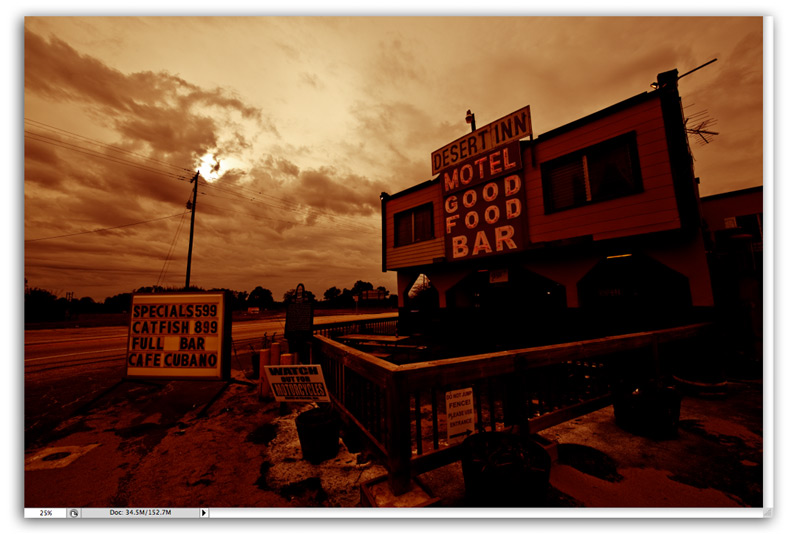
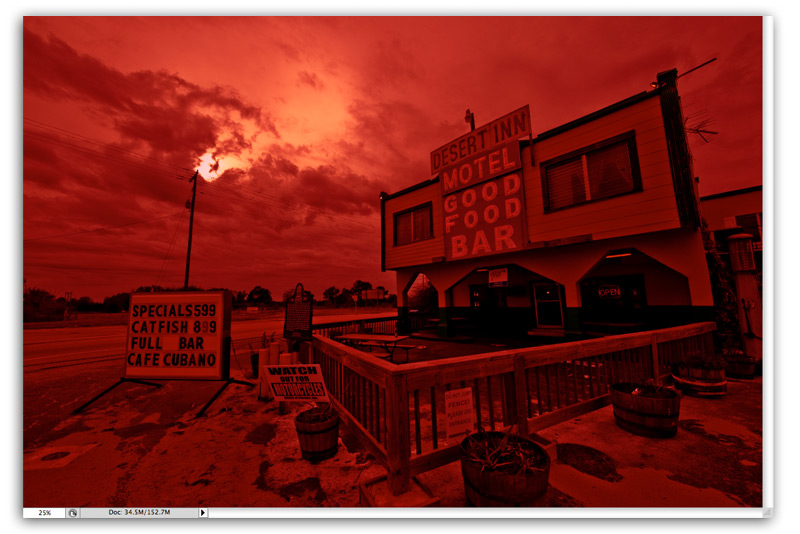
This is the finished group of sky layers. A mask is used on the sky group to mask out the foreground.
Layer 1 is a duplicate of the original raw smart object, color corrected to a deep bronze color. This establishes the base color of the sky. Everything else builds off of this.
Layer 2 is another duplicate of the original raw smart object color corrected to a blood redRed is the first of three primary colors in an additive color model. The "R" in RGB. More color. The layer blend modeBlend Modes control how colors interact with each other. Blend Modes can be applied to layers and br... More is Soft Light with a 30% opacityOpacity is the density of a pixel. Any amount less than 100% will have some transparency. Opacity se... More.
Layer 3 is a highly saturated version of the original image with all of the nuetrals moved towards a purple color. The layer maskLayer masks are used to non-destructively hide or reveal the contents of a layer. More blocks out everything except the outer borders to give the purple sunset feel (see 1st image). The blend mode is normal with an 80% opacity.
Layer 4 is a tonemapped image. The blend mode is set to Overlay. This adds the sky detail and shape. I used Photomatix Pro for tonemapping but Photoshop CS5 HDR Pro can do the same thing.
What Next?
The foreground image needs to match the new sky. We also want to breathe some life into the foreground with shape, textures, and details that are not immediately evident in the original image.
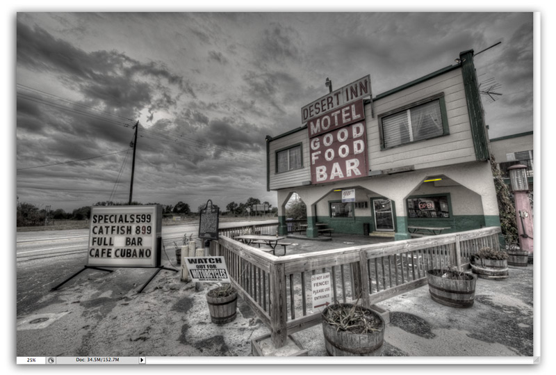
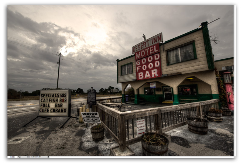
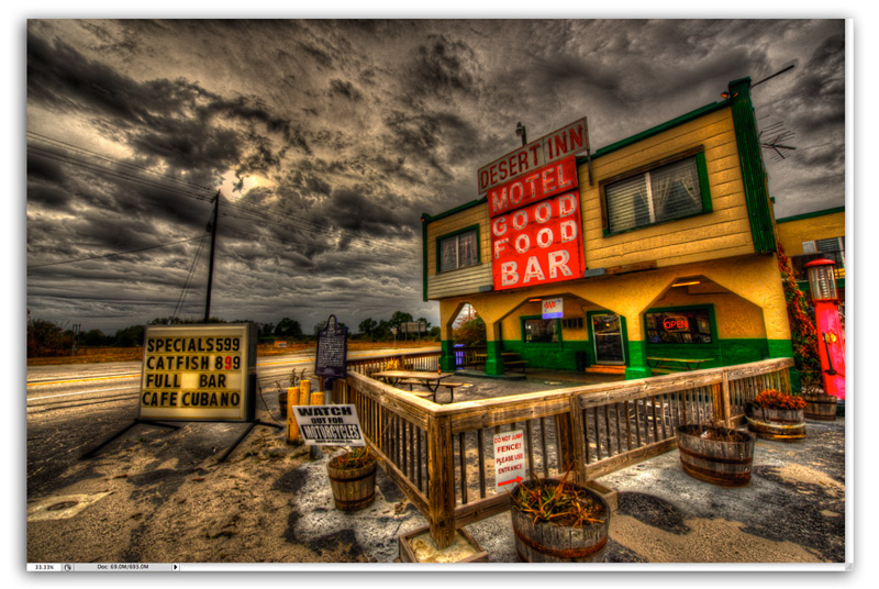
Use Photomatx Pro or HDRHDR is short for High Dynamic Range. HDR (High Dynamic Range) Photography refers to capturing an ent... More Pro to tonemap the original raw image with three completely different settingsAn application's behaviors and preferences are controlled with settings. More.
First, tonemap the image with a mostly photo realistic look. There should be no added saturationThe purity of a color. Zero amount of saturation equals gray. Equal numbers of r,g,b equal gray. More and just enough tonemapping to add some textureTexture in graphic design describes the surface quality of a design. Texture creates a 3D illusion. More and shape.
Next, tonemap the image with a grungey, saturated painterly look.
Finally, tonemap the image for lots of shape and texture but remove most of the color.
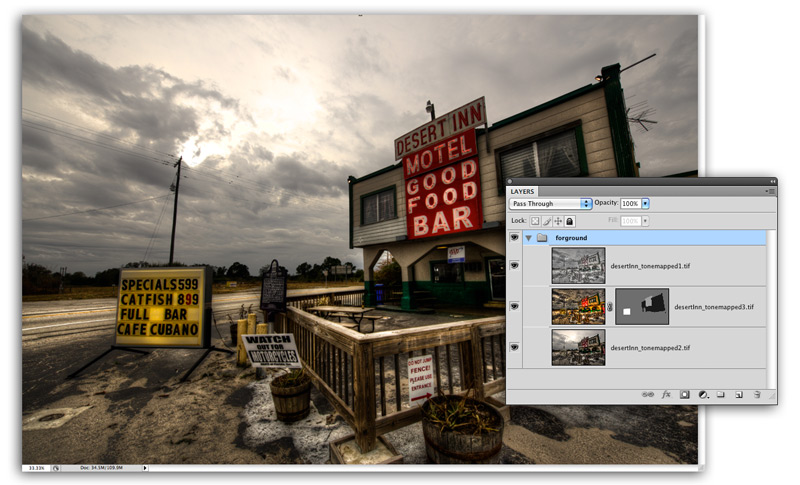
Combine the tonemapped images with layer blend modes and selective masking to create an early evening look.
Layers from top to bottom have the following blend mode settings:
Top – Tonemapped image 3. Soft Light blend mode with 45% opacity
Middle – Tonemapped image 2. Saturation blend mode at 100% opacity. A layer mask controls the amount of saturation for specific areas of the image.
Bottom – Tonemapped image 1. Normal blend mode at 100% ocpacity.
Turn The Lights On
Spot lights, windows and signs light up at dusk so make it believable by turning the lights on. Think like a painter. What should the light look like? Where is the source? How bright is it?
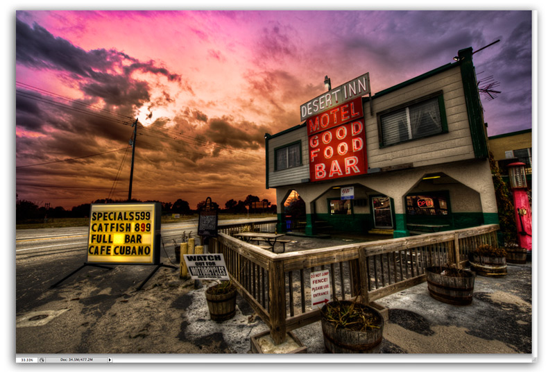
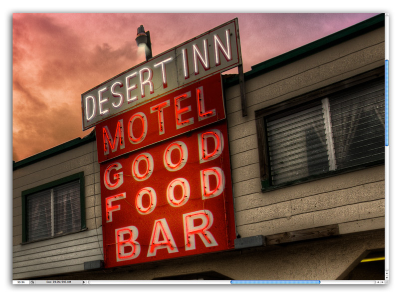
The Desert Inn sign has a spot light, the building corners have small lights, the windows are illuminated by indoor lights, the marquee sign is bright with light and the “Desert Inn, Motel, Good Food, Bar” neon lights are glowing.
Here’s how the Image looks with the colored sky and the lights turned on.
Use the pen tool to draw the neon sign letters and then stroke the paths with a soft brushWhat is (Digital) Brush? A brush, found in digital painting applications such as Photoshop, Painter,... More. This is a pretty easy techiniqe for creating believable neon lights. See this tutorial for similar ideas about lighting.
Clean up the Trash
I don’t like telephone lines, trash and signs that detract from my subject. I always remove these things. It’s my painting after all so I take out what I don’t like.
Sell It
This is an image about a place and time from 50 years ago. Sell that idea by removing any reference to the present time. Signs, concrete posts, AAA sign, the beer bottle and the historic landmark sign all have to go. Removing the historic sign is the hardest but it’s made easier by placing a potted plant in the space where the sign was, hiding where the fence footer should be.
Finally create a new marquee sign. Most of the existing letters can be used for a new sign. Only a few have to be painted from scratch. They are such a small part of the picture it’s impossible to tell the fake letters from the real letters. Think of the sign as a scrabble board. Each letter becomes a scrabble tile. Move the tiles around to spell something new. Skew them to fit where needed.
Wouldn’t it be fun to go back in time and see Johnny Cash play at the Desert Inn? I can hear the music when I look at the finished piece. I hope you can to.

