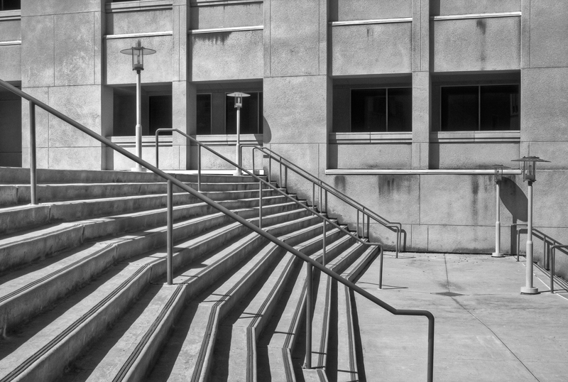
This year I have one image hanging in the San Diego County Fair Photography Exhibit. It was selected for the blackBlack is the fourth color in the process of four-color printing. The "K" in CMYK. Black adds tonal d... More and white architectural category. There is more than a little irony to this since the majority of my photography is not only in color, but color that usually pushes the edges. I only recently decided to work on my black and white photography as a means to help myself see better, with the hopes of improving my picture taking.
I created this image last summer while enrolled in an architectural photography class at Palomar College. This particular assignment was to find repeating lines and shapes to show depth of space. Stairs are a perfect and easy architectural object to show repetition. I made the image black and white because the scene is essentially monochromeA monochrome image is made of a range of only one color or hue value. More to begin with.
I really like the composition of this image. I like how the lines in the stairs contrast with the rectangular shapes of the windows. I like how the hand rails draw your eye from upper left to lower right, while the stairs themselves draw your eye from lower left to upper right. The simplicity of the lower right concrete ground gives your eye a place to rest, and is accented by the diamond shape drain cover. Most of all I like that this image is almost abstract, though it is a very familiar subject.
I put the Theresa Jackson touch on this image by shooting it in 3 brackets and processing it as an HDRHDR is short for High Dynamic Range. HDR (High Dynamic Range) Photography refers to capturing an ent... More. I also removed the trash cans in the upper left because I don’t like trash in my art. HDR processing gives this image a layerAll objects have a stacking order, like a stack of paper. When the layer (paper) is opaque it covers... More of depth and textureTexture in graphic design describes the surface quality of a design. Texture creates a 3D illusion. More that I really like.
Here are the original frames. The final image was cropped to tighten the composition.
The first frame, with balanced exposure for highlight and shadow has no details in the windows. I could have pulled some detail out with selective editing in Photoshop, but it is much easier to do with HDR tonemapping
-2 exposure
+2 exposure


