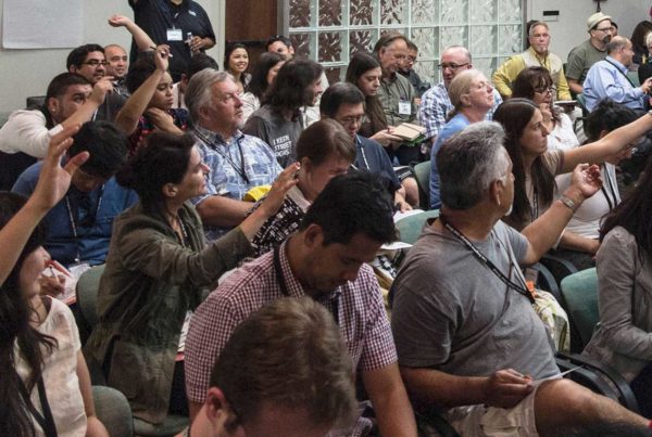
Last Friday I attended the ISA International Signs Expo in Las Vegas. The primary goal was to meet Darek Johnson from Signs of the Times magazine.
Darek and I made fast friends through email but this was our first opportunity to meet in person. Darek was a popular guy at the show. Seemingly everyone we passed wanted a few seconds to speak with him. He graciously greeted them and then introduced me as “Theresa, The Award Winning Adobe Expert.” I hope I didn’t look as overwhelmed as I felt.
I also meet Darek’s lovely wife Li, and spent some time exploring the show with her. Li and I share a love for photography so we had fun looking for compelling imagery. After the show I joined Darek and Li for dinner where we spent some time getting to know each other a little more. Well, truthfuly I ate dinner and they drank coffee, saving room for their later dinner plans. I enjoyed their company so much that I wished I didn’t have to catch a flight back home.
Show Highlights
The show was large. Anything and everything related to signage was represented, from banner grommets, LED lights, channel letters, mobile cranes and more. I tried to see everything but focused on things related to print.
FujiFilm Taskero® Universe™ ColorPath SyncSync matches data across devices. More
I listened to a great presentation for Fujifilm ColorPath Sync calibrating software. This software calibrates and color manages across multiple outputOutput transfers information from a digital file to an external device like a monitor, or printer. More devices including inkjetInkjet is a digital printing technology that sprays ink onto a surface. Inkjet prints do not contain... More proofing, digital press, offset press and wide format. Better yet, the software is web based, so multiple locations can all be in sync with each other.
The demo was impressive. The software looks easy to use and the need for such control makes complete sense to me. I just wonder how many print shops recognize this and are willing to pay for it. In the sign shop world, I see a prevailing attitude of “it’s good enough”. The Fuji rep agreed with my industry assessment but assured me that the desire for quality print and color managementColor management is a system to maximize color accuracy and consistency across files, applications, ... More is growing. I hope he is right.
White Ink
White ink is in. HP, Durst, Océ, Epson® and Roland® all featured presses with white ink capabilities. Designers and photographers should consider the creative possibilities, especially those beyond the obvious white ink base on clear substrates.
HP showcased a flat bed press printing on a blackBlack is the fourth color in the process of four-color printing. The "K" in CMYK. Black adds tonal d... More substrate with white ink. The print quality was impressive but the line artLine art, or line drawings, refers to single-color diagrams or drawings consisting of only black and... More graphics were not. The flat graphics looked silk screened to me. I would have preferred to see an image designed around a high resolutionImage resolution measures the number of pixels in an image as it is displayed or printed. Pixels Per... More halftoneHalftone is the process of producing an image as a series of various-sized dots. More white. Unfortunately I didn’t see anything that really explored this capability.
Flexi10 by SAi
Flexi10 is the leadingLeading refers to the space between lines of text. More software for sign making. I’m familiar with the application but have never worked with it. I watched an impressive demo and learned a bitA bit is the smallest unit of information in a computer. More more about the application.
Flexi can import most all file types including Adobe Illustrator and Photoshop. It can linkLink describes a graphic asset file that is placed in a layout application without being embedded in... More to PDFPDF is short for Portable Document Format. More files avoiding font conflicts. It can also work with third party Photoshop plugins. That’s all pretty impressive, but the way it handles text kerningKerning is the space between individual letters. Each space can be kerned independent of the other l... More and leading blew me away. I wish Illustrator offered the same text features.
Roland® Silver Metallic Inks
Roland featured the industries first metallic desktop printer/cutter. I was excited to learn more. I walked around the booth several times hoping to speak with a representative. The booth was crowded with curious folks like myself. I never managed to get the attention of a representative and left without getting any real information. The lack of attention frustrated me. I was also disappointed with the imagery they chose to feature this exciting technology.
I Imagined a silver black and white architectural photograph, or a rust metallic sepia tone landscape or an ad with a model sporting an intriguing tattoo, flecked with silver highlights. The possibilities are endless. Unfortunately Roland® missed the ball with their image choices.
Most of the presses were busy churning out color patches of metallic color possibilities. The featured graphic image was a photo of large silver painted lips. I thought the silver lips were disturbing and didn’t understand why they used it, especially after I found better ones on their website.
I left thinking “I wish I could create marketing graphics for Roland. They need my help. I would have so much fun exploring the possibilities.”
Epson®
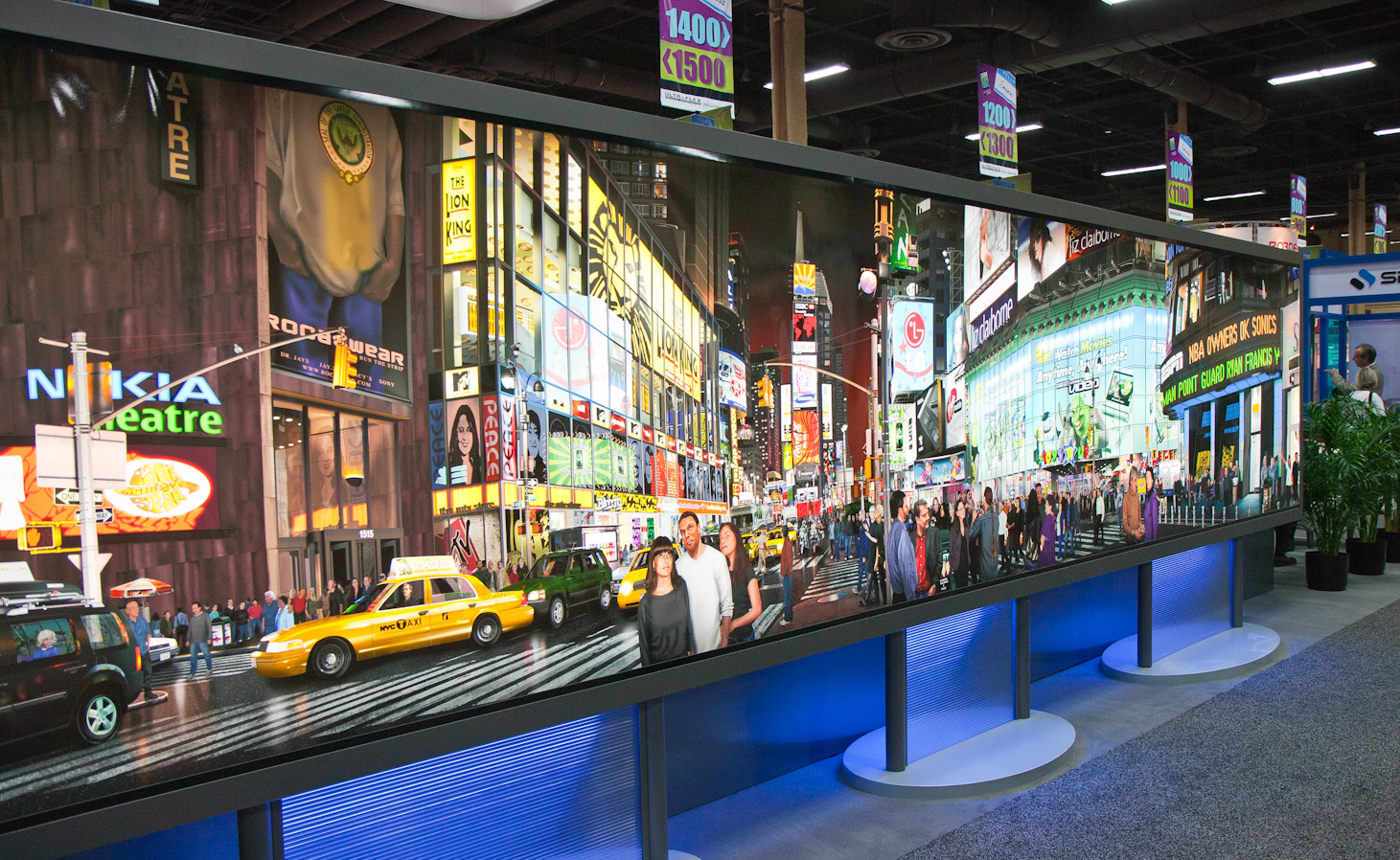
Burt Monroy’s Time Square Digital Painting was on display at the Epson booth. I’ve seen it before but still enjoyed examining the craftsmanship and picking out the recognizable Adobe characters. You can always count on Epson to show off high quality images. Maybe that’s why every photographer I know prints on an Epson.
Time Square Digital Painting by Burt Monroy – printed with Epson DisplayTrans Backlight Media
Impressions
The sign industry is large and growing. The last expo show I attended was Photoshop World, held in the same exact exhibit hall. The Signs Expo is much, much larger.
I had this sense that I might be the only graphic artist wandering the floor. I probably wasn’t, but it felt that way. The Signs Expo is an extravaganza of lights, colors and designs, a visual feast for any artist.
It stands to reason that the community of artists who design for this technology would be growing along with the industry. I’d like to know where that community hangs out because I would like to join them.