I’m most comfortable with subjects that don’t move much, preferably shooting with a tripod and lots of time to compose my image. I will never be a concert photographer, or an event photographer or even a portrait photographer.
So why did I pay an extra $199 to take the pre-conference, Real World Concert Photography class at Photoshop World, taught by professional photographers Alan Hess and Scott Diussa? Because I wanted to have fun, and I wanted to challenge myself with something I am not very good at.
It was a challenge all right. I made pretty much every mistake possible. Here’s what I learned.
Exposure
We were told to shoot in the manual mode starting with these settingsAn application's behaviors and preferences are controlled with settings. More, ISO 1600, f/2.8, 1/250 sec, using the spot meter mode to read the light on a subjects face and adjusting the shutter speed to balance the exposure. This worked great. My exposures were overall excellent, so I’ll give myself an ‘A’ for this part of the lesson.
Everything started to fall apart after that.
Focus
I shot with a single point auto focus. The goal was to pick my subject, focus and then shoot. I ended up with too many images like this one, and a whole lot more that were close, but not perfect. Too quote Scott Kelby, I did not shoot tack sharp images, not even enough tacky sharp ones.
Microphones
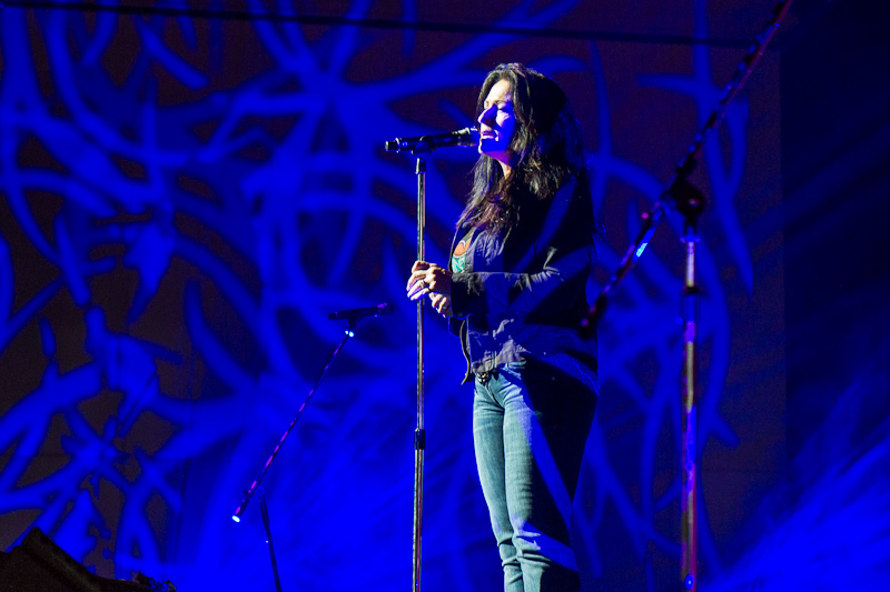
Microphones cast ugly weird shadows. They can ruin a good image. I have lots of examples to prove it.
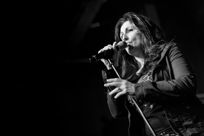
I might have liked this image if it wasn’t for the dark shadow dribbling down Kalebra’s chin.
Composition
The basic tips for good composition are, pay attention to the background, look for distracting objects around the frame edge and don’t cropCrop is used to change the size and dimensions of the canvas. Photoshop's crop tool can be used to d... More off the guitar neck.
I was going for the arty, close up, narrow depth of field, detail shot. I remember thinking this looked awesome when I took the picture.
It’s too bad I didn’t take a look at the edges of my frame. I missed pretty bad, and to make a bad shot worse, the focal point is Felix’s shirt, not his hand.
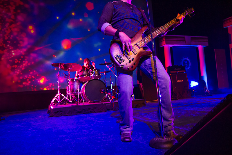
Felix Nelson with Scott Kelby on drums
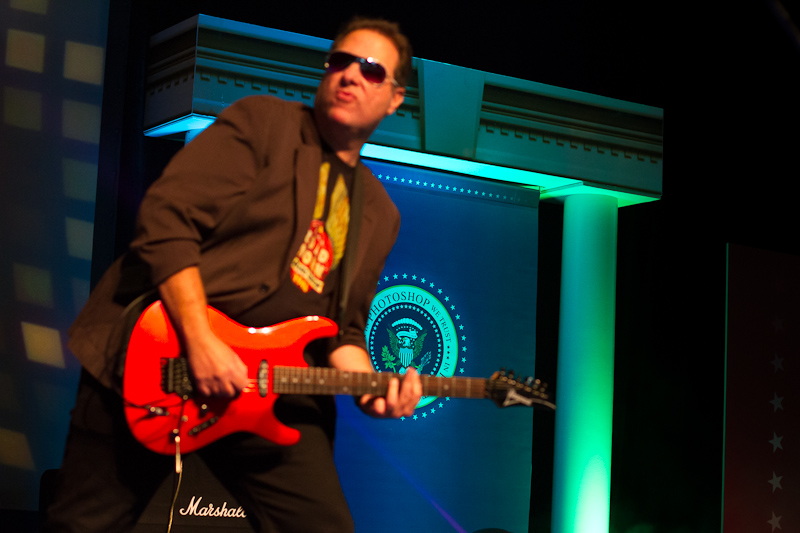
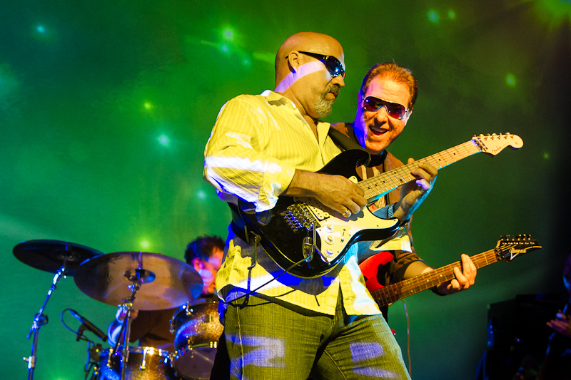
Hey, I got all of the guitar in this one, a cool background and it’s in focus. What more could I want?… except maybe the guitar player’s head.
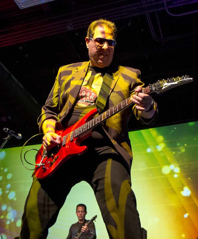
Scott Kelby with Felix Nelson as back up
I don’t even know what to say about this one, except that it made me laugh out loud when I saw it. I remember going for the guitar hero look, shooting up into the rafters. I don’t remember seeing Felix standing between Scott’s legs. I’m pretty sure a guitar hero would not like an image of the bass player between his legs.
The Drummer
Tips for capturing a good drummer shot are; shoot on the down beat so the sticks are in the air, try to get both sticks in the image, wait for the spot light to hit your subject, and try to capture the energy.
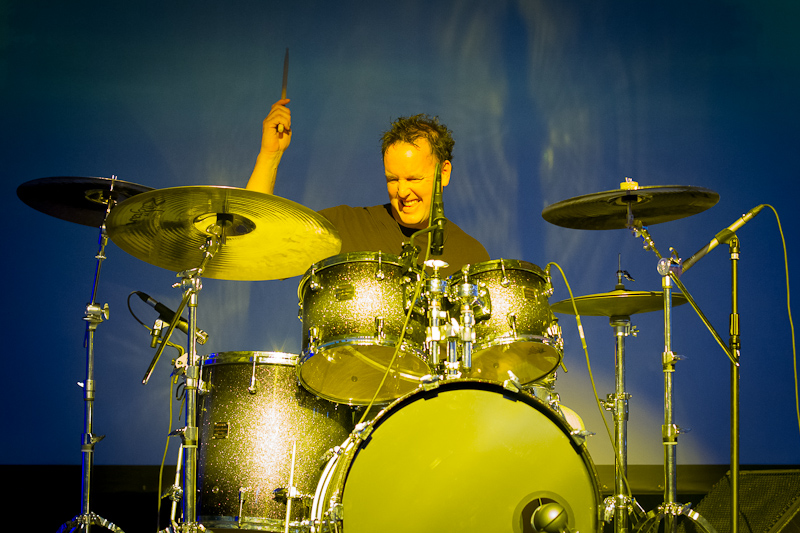
Shooting on the up beat was easy, but I only caught one stick in this shot, and it looks like his arm is growing out of the symbol.
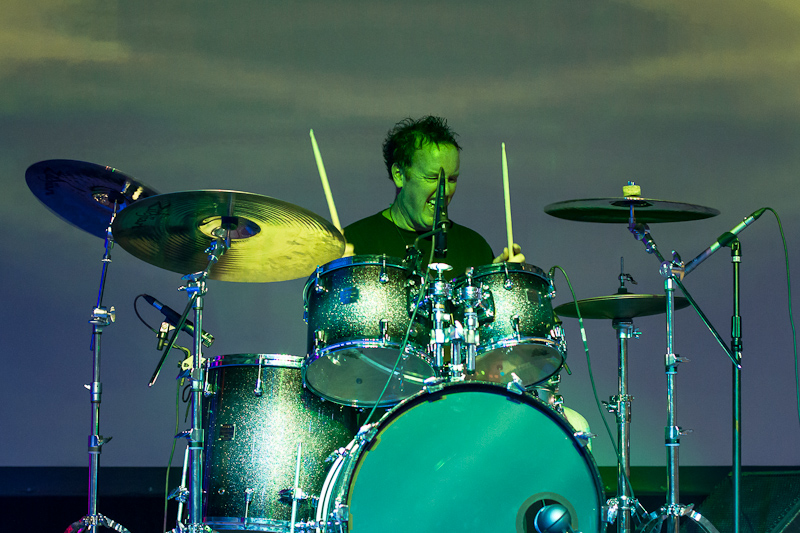
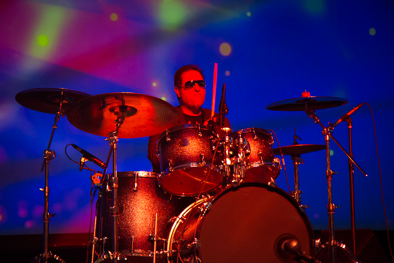
I caught both sticks and a good expression on this one. Maybe I can use Photoshop to fix his greenGreen is the second of three primary colors in an additive color model. The "G" in RGB. More flesh and cloneClone means to duplicate. The clone tool is used to paint one part of an image onto another part of ... More out that microphone.
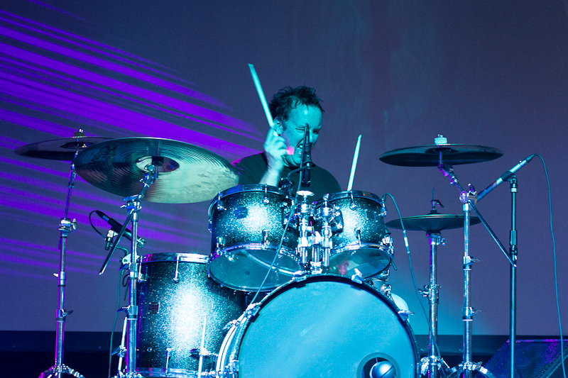
I caught both sticks, a great expression and a cool background in this one, but there’s that damn microphone again.
I took 42 frames of Scott Stahley on drums. All of the others suck worse than the ones I shared here.
I photographed Scott Kelby on drums, with pretty much the same results,
or maybe even worse. This looks like Scott is redRed is the first of three primary colors in an additive color model. The "R" in RGB. More hot mad and flipping someone the bird, and the focal point is the drum, not his face. Maybe for this shot, that is a good thing.
Lighting
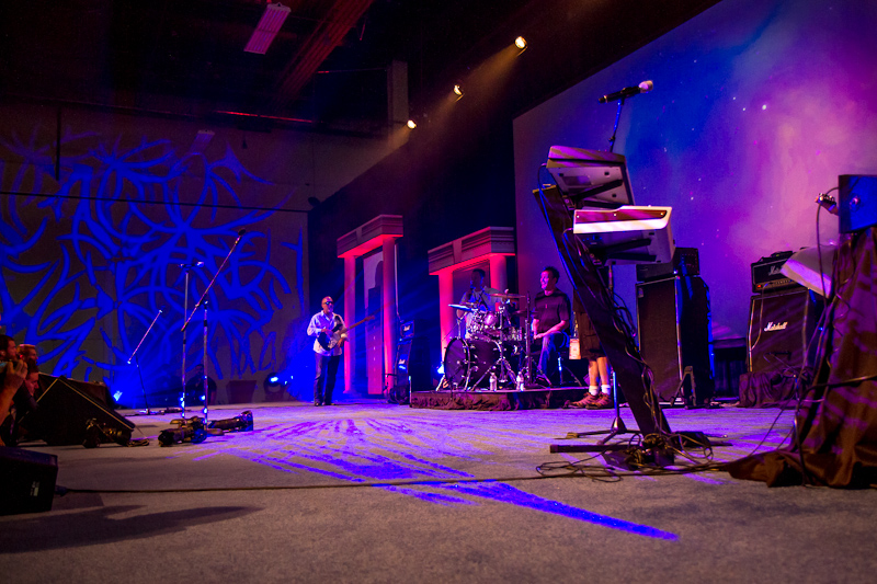
The concert lighting was awesome. There were colorful lights and cool patterns running across everything. I loved how it looked in my view finder.
We had a teaching intermission after the first three songs. During that time I staked out my spot in the far right corner. I loved these lights and certain I was in position to get the best shot of the day.
It didn’t work out the way I had planned.
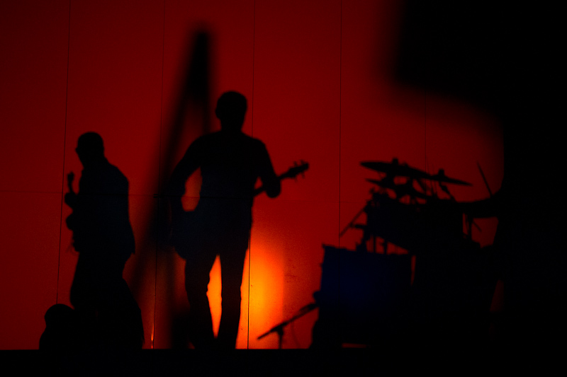
The light patterns obliterated the band members. This could be titled “Where’s Felix?”
BlueBlue is the third of three primary colors in an additive color model. The "B" in RGB. More is sometimes a good color for eye shadow, but never for foundation.
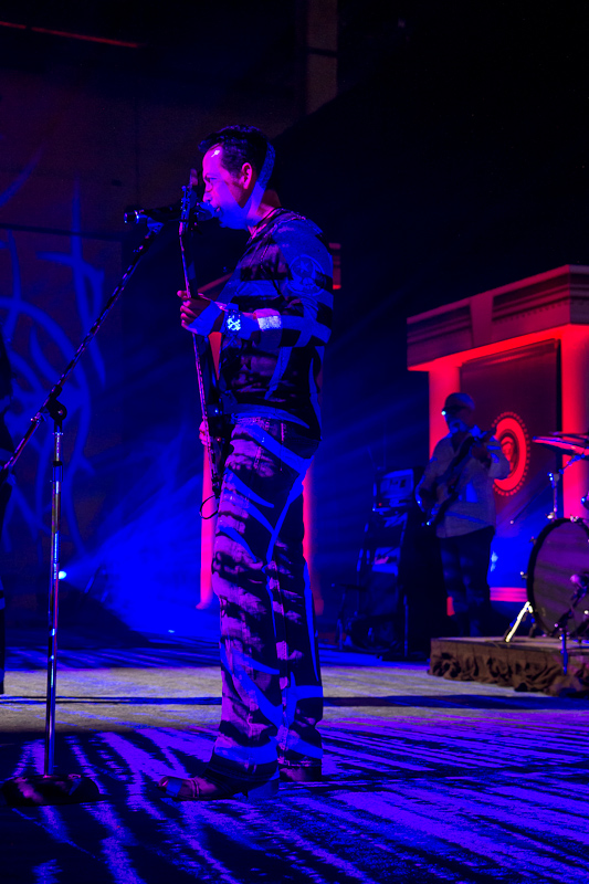
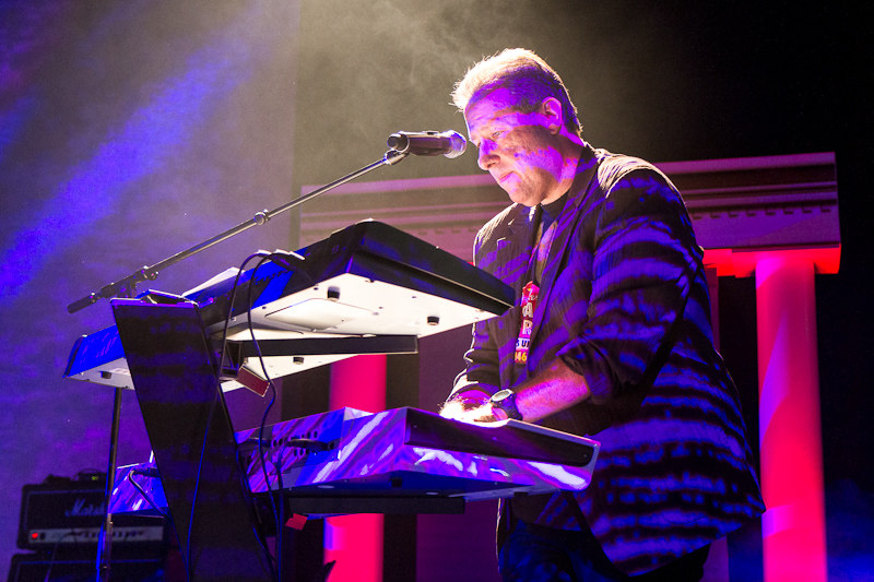
I thought this shot would be awesome with the smoky background, back lit hair and red columns framing Scott, but I don’t think even my Photoshop skills could fix that zebra stripe, skin disease across his head.
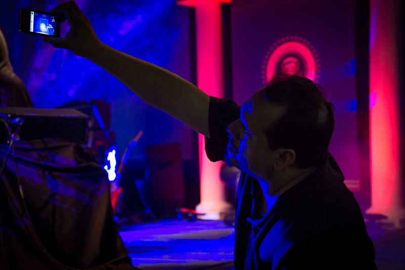
I’m pretty sure RC got a better picture with his phone than I got with my camera.
Distracted by the Abstract
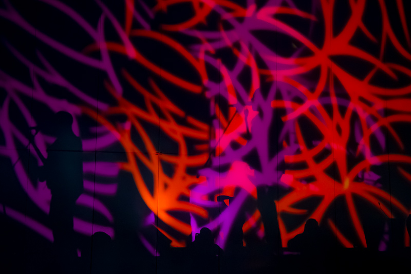
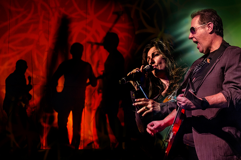
The crazy lights created some fun shapes, colors and shadows on the far left wall. I took a lot of pictures of the wall. I couldn’t help myself. This is the kind of image I am naturally attracted to, and I knew they could be good for a possible composite image.
The Contest
Nikon sponsors the class. I knew there would be a contest with a camera giveaway. I wasn’t sure I would even enter it, but I knew for sure that if I did enter, it would be with a composite image. I had decided this before I even left for Vegas. When Alan Hess told the class, “if any of you Photoshop gurus want to create something, that is fine, just make sure all the images are from today”, I figured he was speaking directly to me. That convinced me to make it happen.
I didn’t win but I am still proud of my effort.
I created this in about 2 hours, on a 13″ Macbook. The working conditions were less than ideal which was good for me. It made me think quickly and not stress over the details.
The actual winning image looked a lot like this one,
only much, MUCH better. At least I was in the right place at the right time to capture a winning image. I should be proud of that, right?
A couple shots that don’t suck
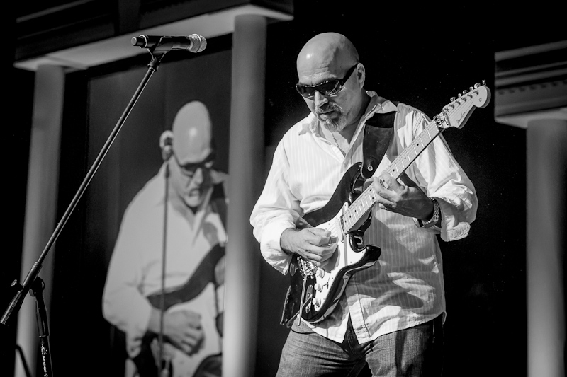
We learned that sometimes an image needs to be converted to blackBlack is the fourth color in the process of four-color printing. The "K" in CMYK. Black adds tonal d... More and white to look good. The colored lights can make some images look really strange.
I liked the repeated image of Tony on the screen, but the colors were all over the place. The black and white made this image look much better.
I was also disappointed that the focal point is on the guitar and not his face, but interestingly the black and white conversion really minimized that too.
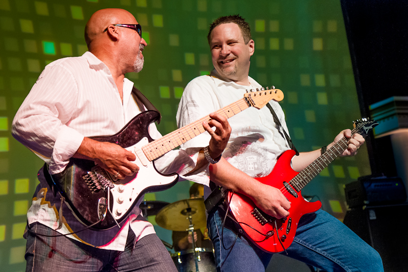
This may be my best shot of the day. I love the expressions, the background (except the black on the right edge, but I could easily fix that in Photoshop), and best of all it is in focus. Yay!
This was shot in the last seconds of the very last song. Maybe I really did learn something.
Seriously, I do feel like the experience made me a better photographer. Thank you Alan and Scott!

