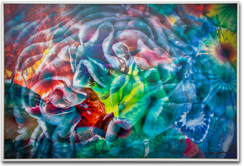
ChromaticNot white, gray, or black. RGB color values are not the same. More Illusion is different than anything I have shown to date, primarily because of the print technique. Chromatic Illusion is printed on Dibond® aluminum composite material with UV-cured inks. The print was done by reproHAUS on an Océ Arizona flatbed printer. The Arizona flatbed offers White Ink capabilities. White Ink opens up so many creative possibilities and reminds me of the days I worked for a trading card company. The White Ink capability is the reason I chose to print Chromatic Illusion at reproHAUS.

what the white print would look like without color on it
I had an idea of how the final print would look, but honestly it didn’t turn out like I had imagined. Chromatic Illusion is an example of how the print process can be as much a part of the creative process as the photography and the Photoshop work. I expected the inks to print with some translucency, allowing the metal sheen to come through the color in the areas without white ink. In reality the UV-cured inks are very opaque making it difficult to see the metal surface. The result is different than I had imagined, but still I am very happy with the final print.
Bringing my graphics and fine art worlds together
I first visited reproHAUS to meet the Sales Manager, Marc Aguilera. We met to discuss the possibility of my doing creative or production work for some of his clients. When I saw the Arizona flatbed my creative mind kicked in. I started imagining all the possibilities for fine art photography, even though the press is traditionally used for signage and environmental commercial graphics. It makes complete sense for me to bring these two worlds together.
What I like about the print
The dense opaque ink sits up high on the substrate, giving the print a 3D feel. The white ink creates a luminosity that changes depending on the viewing angle. This adds to the 3D look and gives it a holographic feel as well. I feel that the composited flowers image is complemented by the 3D effect.

close up detail shows the textural quality of the ink
I like the play of industrial elements contrasted with the beauty of flowers. The colorful parts of the image are from the Las Vegas Bellagio lobby ceiling where there is a beautiful installation of glass flowers. I like that the real flower in the image is contrasted with the glass, metal and inks and it is the only part of the image without color.
I like how the white jumps forward at you. It really pops off the image unlike any other photographic print I have seen. The white is the first thing you see when you look at the printed picture.
Things I can improve
I’m a little disappointed that I can’t see the metal surface. I will prepare my next print a little different, completely knocking out all inks in selected areas so that the metal surface will show through.
There are a couple areas in the print where the ink dots are creating a moire´ pattern. I saw the pattern immediately, probably because of my litho background. I’m pretty sure the moire´ pattern happened because I used extreme grain and sharpening in the image. The combination of the sharp grain and five colors (CMYKWhat is CMYK? Cyan, Magenta, Yellow, and Black (or Key) are the four colors of ink used in four-colo... More + white) is probably creating the moire´. With this knowledge I am pretty sure I can eliminate it in the next print.

moiré pattern
Flower Power Show
Chromatic Illusion is part of the PAG Flower Power show. It will hang in the Escondido Municipal Arts Gallery for the month of April. I hope you get a chance to stop in and see it in person.
Escondido Municipal Gallery
262 East Grand Avenue
Escondido, CA 92025
April 5 – May 7